Veranda: September 2021
Written by Stephen Wallis | Photography by Stephen Kent Johnson | Link to Article
Designer Robert Passal Achieves Uptown Elegance in a Downtown Pied-À-Terre
Warm, tonal serenity floats above the high-flying action of New York’s Flatiron District in a polished three-bedroom apartment in a historic building.
For Jocelyn and Jeffrey Kraus, it was, as the saying goes, all about location. And the right decorator.
A few years ago, with their three adult children growing their own families and Jeff eyeing the day when he would scale back his role at Spectrum Retirement Communities (the company he cofounded), the Denver-based couple set out to fulfill a longtime desire for a pied-à-terre in New York City. “I have loved New York since I was a child,” says Jocey, as she prefers to be called. “And I’ve always had a particular fondness for the Flatiron Building and its neighborhood. It’s central, and I can walk everywhere: to the theater, to the West Village, to SoHo, and, of course, to a million restaurants.”
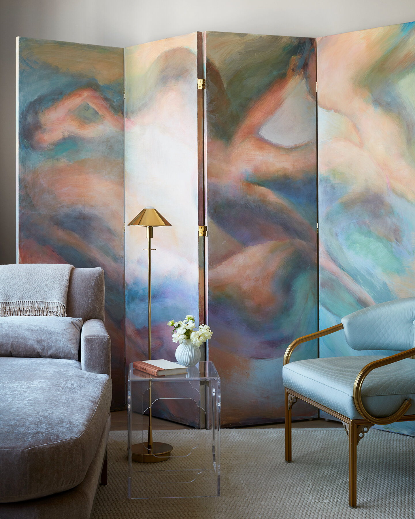
A hand-painted screen depicting abstract nudes by artist Francis Nguyen brings ethereal color to a corner of the living room.
So when the couple found a three-bedroom apartment in a historic building overlooking Madison Square Park with views of the Flatiron, they wasted little time in dispatching trusted designer Robert Passal to weigh in. Passal had bonded with the family several years earlier while renovating the Manhattan apartment of the Krauses’ eldest son.
Jocey not only admired Passal’s flair for layering furnishings and objects from disparate periods but also his keen intuitiveness. “I rarely told him what I liked. It was as if he knew,” she says.
The designer gave his blessing to the couple’s purchase of the apartment, which sits on a high floor in a 24-story 1912 building with Gothic and Romanesque details. Once occupied by furniture and garment makers, the tower underwent a multiyear residential conversion starting in 2015, with Helpern Architects overseeing structural renovations and Pembrooke & Ives handling the interiors. The building made headlines when Amazon founder Jeff Bezos snapped up multiple units at the top, including the triplex penthouse.
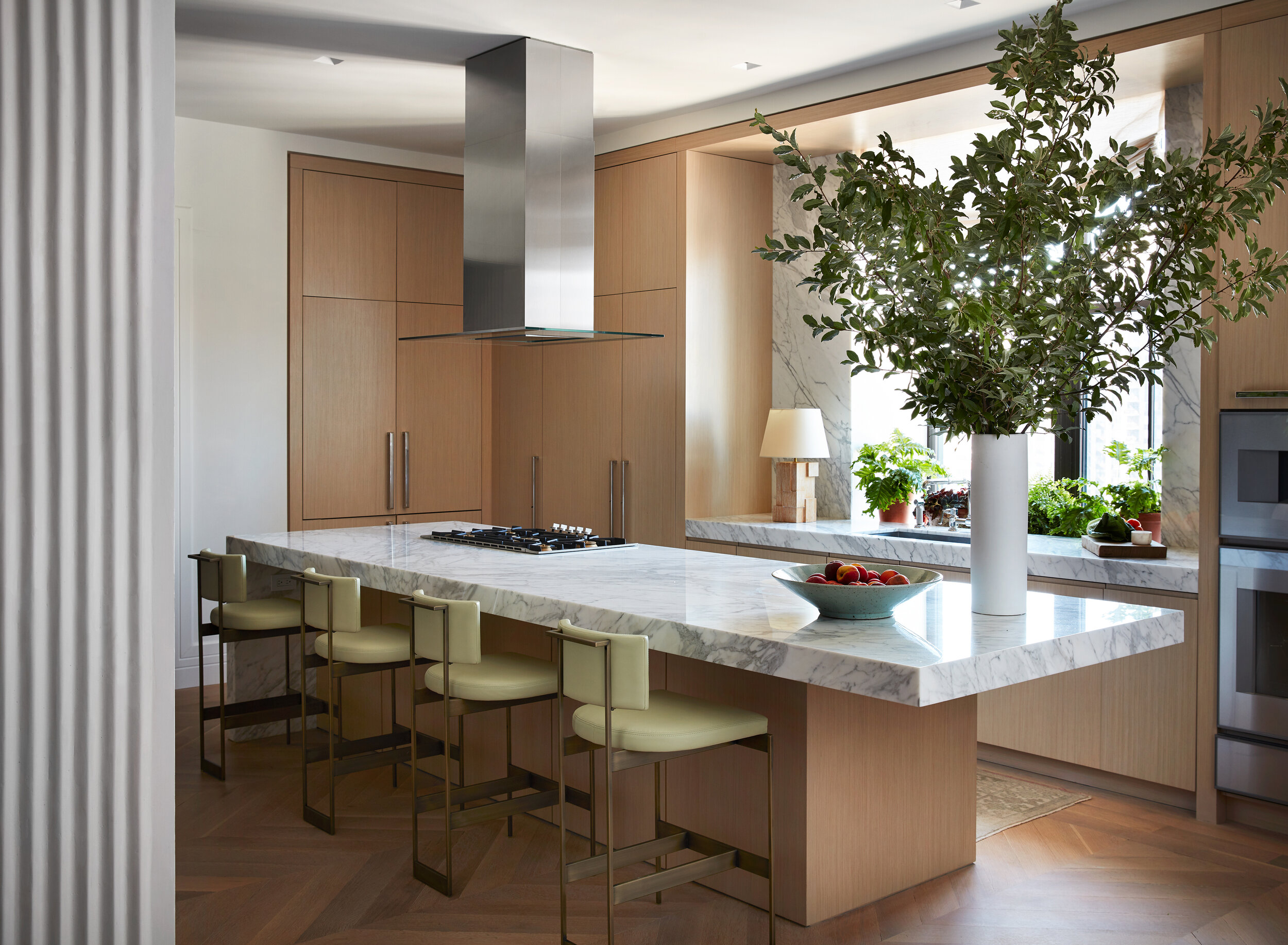
Sculptural metal counter stools are finished in antique brass and upholstered in pistachio leather (Jerry Pair).
While they may have some high-flying neighbors, the Krauses are decidedly down-to-earth, Passal says, and that’s reflected in their priorities for the space. “The apartment wasn’t meant to be splashy,” explains the designer. “We had a distinct look we were going for, which was calm and clean.”
Comfort and functionality were also key. “I didn’t want it to be casual, but I wanted an apartment where people felt like they could walk in and sit down anywhere,” says Jocey. “Not those rooms where you feel like you have to perch.”
They preserved the 3,200-square-foot residence’s existing layout and retained a good deal of Pembrooke & Ives’s millwork and surfaces, but Passal added a number of space-redefining touches. For starters, he stripped the gray-tone floors and refinished them using a matte wax oil that reveals more of the wood’s natural graining and color variations. In the entrance area, the designer brought in artisans to embellish the walls with fluted plaster, making a subtle yet high-impact statement. “It’s all hand-trawled,” he says. “That was two months’ worth of work.”
Tour This NYC Pied-À-Terre
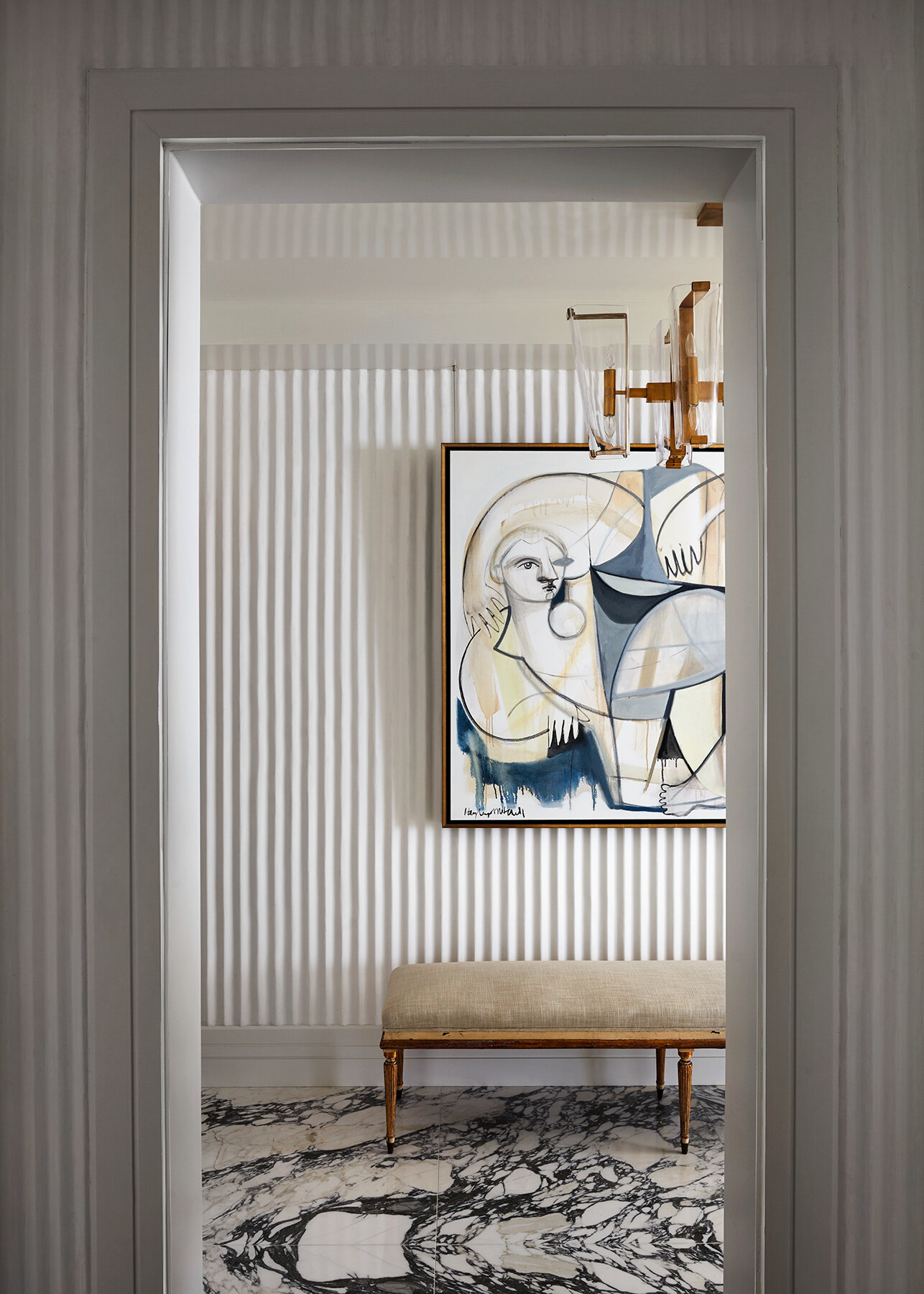
The plasterwork serves as a backdrop for a Picasso-esque painting of sunbathers by Hayley Mitchell along one wall, while opposite, Passal installed a vintage straw marquetry mirror over a contemporary bronze-and-leather console that hosts a sinuous abstract bronze sculpture by Antonio Grediaga Kieff. As with the rest of the home, “the idea was to make the space feel approachable but artful, using a mix of different eras and aesthetics,” says the designer, who got his start in interiors working in John Rosselli’s New York showroom, a legendary source of sophisticated eclecticism.
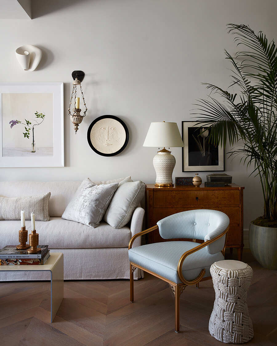
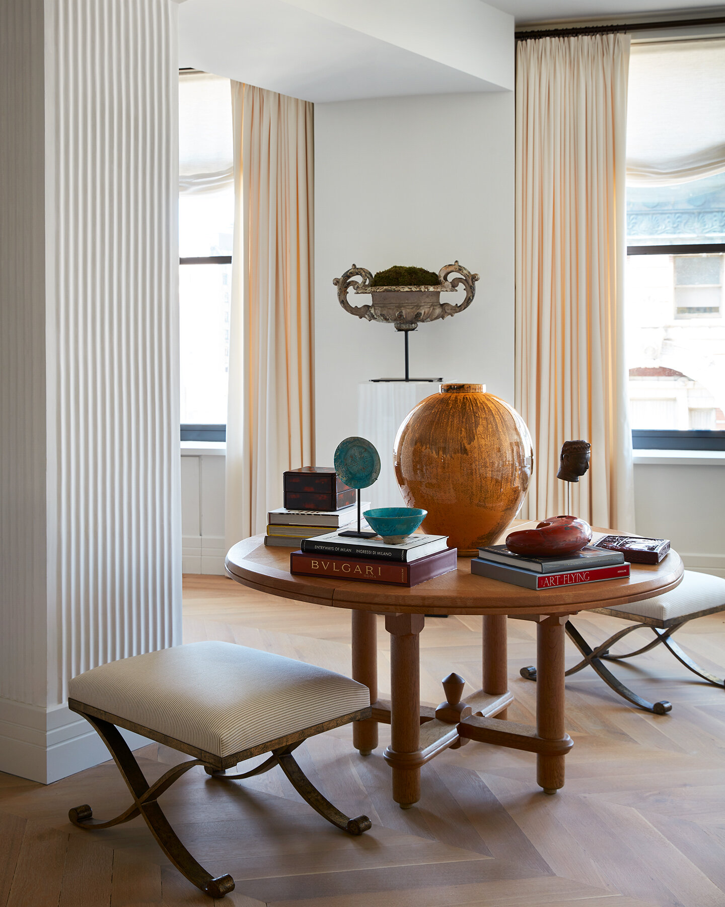
Sprinkled around the living room among the pale upholstered seating are diverse works of art and objects, from Wedgwood ceramics to ancient sculptures. A handful of pieces are displayed on a circular table that can be expanded with leaves to seat eight for dinner. But Passal says the Krauses never intended this as a place for entertaining: “Jocey said, ‘You know, I’m not coming to New York to cook for 20.’ ”
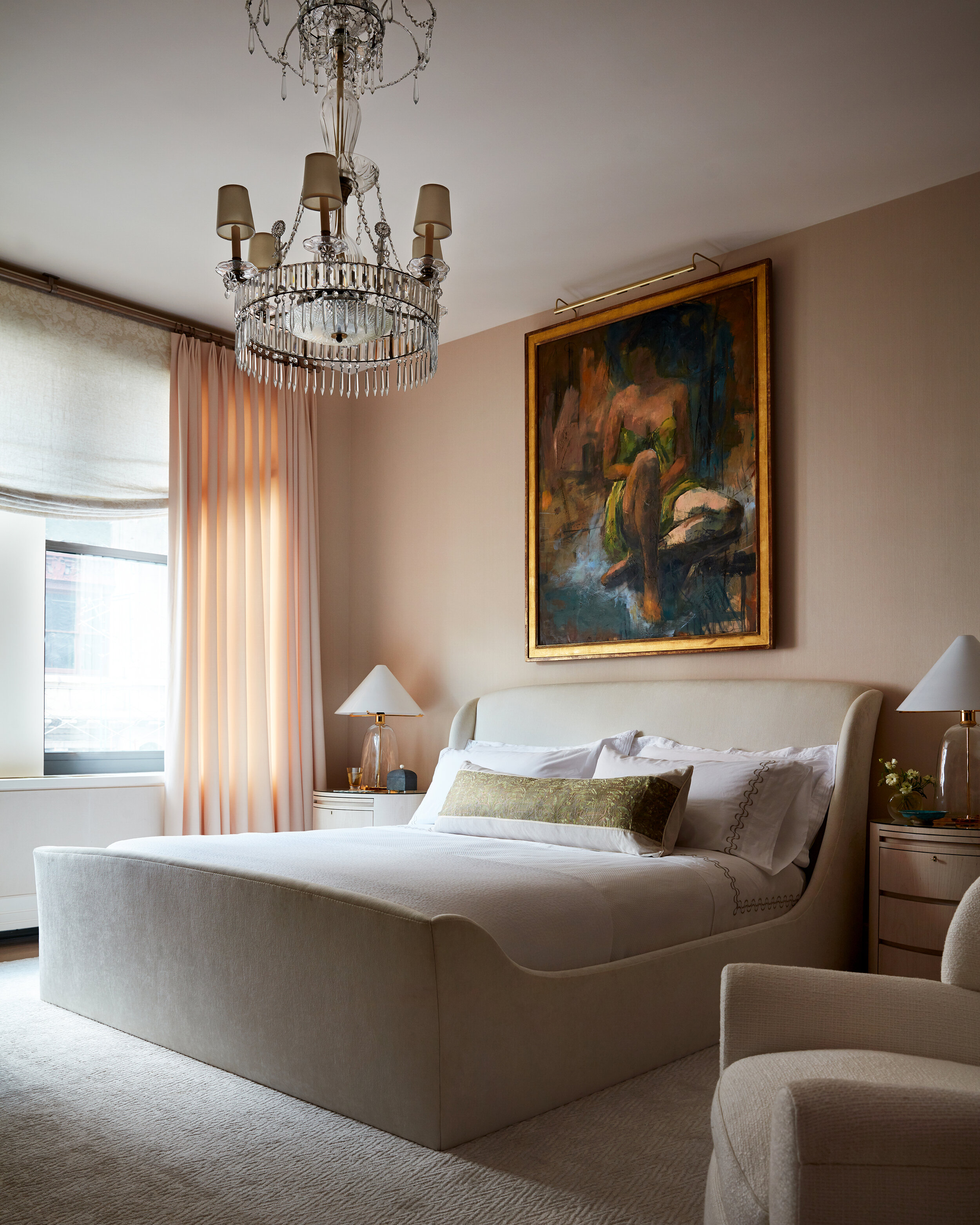
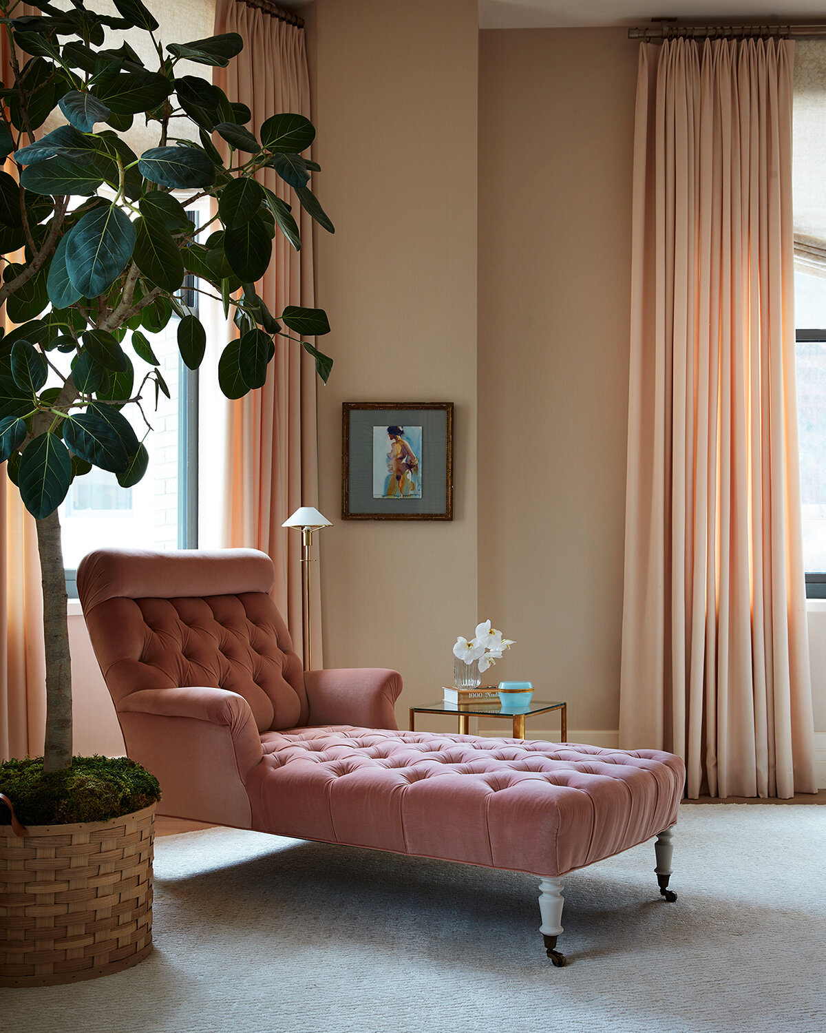
In the Krauses’ bedroom, a velvet 1920s French arm chaise. Fabric, Stroheim. Wallcovering, Altfield
From the outset, the couple envisioned the apartment as a private sanctuary where they could each have cozy spaces of their own. In Jeff’s case, it’s the cocoon-like, walnut-paneled den outfitted with a plush L-shaped sofa facing a large television and everything in a palette of chocolaty hues. Jocey, meanwhile, can often be found on her Jean-Louis Deniot chaise next to the window with a book, sometimes just gazing out. “She wanted little reading nooks and places to hang out or have a conversation,” says Passal, who commissioned Vietnamese artist Francis Nguyen to paint the folding screen with ethereal abstract nudes for Jocey’s quiet corner, adding a splash of soothing color. “It was a way to create a moment without it being over-the-top.”
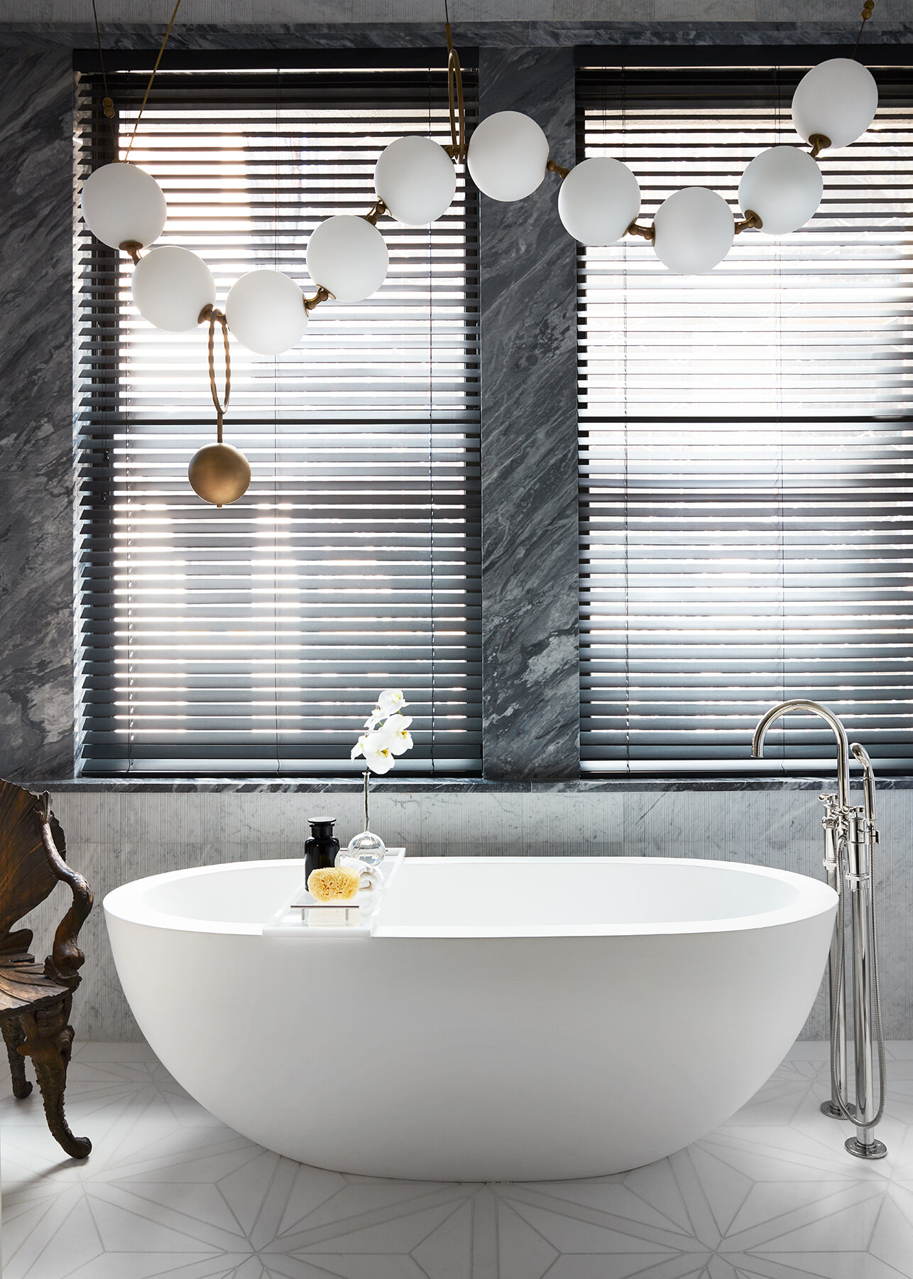
Handcrafted, pearl-like lighting by Canadian designer Larose Guyon dangles over a deep soaking tub.
A bigger showstopper can be found in the couple’s bath. Jocey had fallen in love with a light fixture that resembles a strand of pearls by Quebec’s Larose Guyon, only to abandon the idea for cost reasons. But with renovations wrapping up just as Jocey was having a major birthday, her husband colluded with Passal to surprise her. When the designer brought the couple to see the completed apartment for the first time, there it was, floating above the freestanding tub. “I had no idea,” says Jocey. “My favorite kind of jewelry is pearls, and it not only made the bathroom, I think it made the whole apartment. I mean, it’s just magnificent, isn’t it?”


